Saturday, July 30, 2011

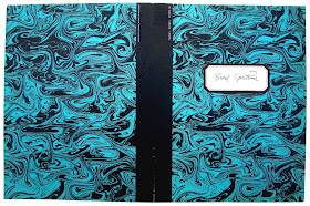
Broad Spectrum / Issue 1 / 1962 / Simpson Lee Paper


Back in 1962 Simpson Lee Paper launched a lovely looking sampler designed by Gollin, Bright & Zolotow (Norm Gollin was famous for his Claude Monet Seasons & Moments poster for the Los Angeles County Museum). The brochure only had eight pages plus cover and it promoted Simpson’s Broad Spectrum line of papers.
    What makes this little brochure rather fascinating was the printing. The stock was a very light blue and part of the design had eight black and white Polaroids over four pages. To do this successfully required two passes through the press of white ink to create a solid white Polaroid shape on the page. The next complication was printing the photos with a three hundred screen on the white ink. Finally, to create a notebook effect process blue lines were printed.
    The other four pages with a fish, some netting and sea shells again had two whites, black, brown and process blue inks. The photos were printed as duotones and the center spread, with a piece of netting, was a challenge because the notebook lines (in blue) all had stop and start for the netting.  Overall, a real challenge for any printer even today and this paper sample was printed in 1962.  This first sampler in the series got off to a cracking start.
    I’ve always loved this little brochure because of the simplicity of the design but it all becomes more intriguing when the printing problems are explained. Included with the brochure was a single typewritten sheet about the printing.


Wednesday, July 27, 2011

One for the road / 1975 / BF Goodrich

A handsome looking book with the title stuck onto the linen cover. Eleven inches square and just twelve pages of thick cream stock inside. It was designed by Tom Smith, Creative Director of the Cleveland agency Griswold-Eshleman in 1975.
   Why it was published and in a very limited edition I have no idea. One of the agencies biggest clients was the BF Goodrich tire company and their logo is centered on the last page.
   The romance of the road copy and illustrations work a treat and don’t forget the Burma-Shave ads bottom right on each page.


Monday, July 25, 2011

Imagination 1 / Office papers / 1963 / Champion Papers


The first Champion Papers Imagination sampler was dated 1963 and oddly it had a price of $7.50, though I doubt anyone ever paid for a copy
     Paper companies had always supplied printers with sample books and they in turn showed them to clients to chose a suitable paper for a job. It was probably in the late fifties that paper companies started to promote their product directly to designers and small volume printers who sold themselves as more than just jobbing printers.  They realized that this had to be more than just blank sheets of paper bound up as a sampler. Why not show how the paper could handle various printing techniques like litho, gravure, silkscreen, folding, cutting, embossing et cetera. These samplers for designers became ever more elaborate during the sixties and seventies.   
     
     The Imagination (above) series ran from 1963 to 1988 and twenty-six issues were published. Each issue chose a subject and explored it with photos, illustrations, graphics and printing techniques on differnt Champion papers. Various well known designers worked on them. From issue twelve James Miho was the Art Director and these samplers became works of art.
    The subjects were 1 Office papers  2 Flight  3 Woman  4 Envelopes  5 Corporate image The Modular Car Company  6 The West  7 Fire  8 Boats  9 Man in the Moon  10 Circus  11 Railroads  12 San Francisco  13 Sport  14 Trees  15 Scandinavia  16 Brazil  17 Australia  18 Hong Kong  19 Safari  20 Rivers USA  21 Ireland  22 Main Streets  23 Catalogues  24 Time  25 Fun and Games  26 White on White, this last one was published in 1988.
    This first Imagination on Office papers was designed by Carl Regher.  Check out my Archive Index in December each year to see the rest of this amazing paper series. or go to March 2020 for a complete list and months/years they appeared in Past Print.


Friday, July 22, 2011

Come home to jazz / About U.S. / The Composing Room / 1960

Come home to jazz was the first of four booklets published by the Composing Room in conjunction with the German print/graphics magazine Der Druckspiegel in 1960. The booklet was designed by the great Herb Lubalin and a spread or two is frequently shown in books and magazines that feature his work. Now you can see the complete thing. 
   I always liked his brilliant typography in this booklet and the way he used line art as a very strong graphic element.  Years later the artwork was featured in the March 1978 issue of U&LC which I've placed below the original.   Have a look at the August 19 Post for the three other booklets in this Composing Room series of experimental typography.