Sunday, October 30, 2011

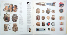
Radio premiums / Westvaco Papers / 1981


Westvaco is probably best known as the paper company that published the free graphic arts magazine Westvaco Inspirations. Started in 1925 to showcase the companies papers for printers it became famous when Bradbury Thompson became the Art Editor in 1939 and designed all the issues up to the magazine’s closure in 1962.
    This large, eleven inches square, eighteen page brochure continues the excellence of design that Westvaco was known for and it’s a good example of paper sampler idea that companies developed from the sixties onward. Present the product, for designers and printers, in a format that will ensure it doesn’t end up in the trash.
     The theme here are the radio premiums from the golden age of radio serials during the thirties to the fifties. Aptly titled ‘…so send before midnight tomorrow…’ the pages celebrate the wonderful goodies that no kid could do without, especially if he was the first on his block with a new item. Jo Durden-Smith’s copy perfectly captures the feel of the times and the wonderful photos and graphics ensure that this brochure stays in the files.


Saturday, October 29, 2011

Qantas / 1980s


The perfect brochure to promote Qantas (the Queensland And Northern Territory Aerial Services, started in 1920). Thirty-six pages and designed by Kit Hinrichs, he says it was designed sometime in the early to mid 1980s.  Hinrichs is a designer from the old school which believed in doing things properly, for example: text wrap drop caps; use a limited number of typefaces; blend big and small photos and graphics on the page so that nothing looks out of place; lock cutout images into text areas.
    All of these and more are working hard on every page here. From the perfect front and back cover (above) to the center which has a wonderful fold-out, thirty inches wide, with twenty-nine small visual items with captions and a big strip graphic across the middle. Despite the busyness it all works perfectly.  This Qantas brochure really cannot be faulted and it could just as easily be published today because the concept is timeless.
    In 1990 Kit Hinrichs wrote a book Type wise (ISBN 0891343563) about typography and his thoughts on design, well worth searching out on the net.


Sunday, October 23, 2011

AIGA Color book / 1974

The complete book is in the June 2021 archive.


Friday, October 21, 2011

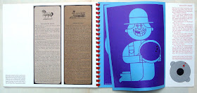
View 1 / Champion Papers / 1960


This was certainly a strange publication for a paper company. It came in 1960 when the Red menace was going strong and eternal vigilance was required from all right-minded citizens to prevent a Commie takeover of the lands of liberty. The editorial is something one would expect from the defense industry who obviously had an interest in promoting Sixties paranoia and patriotism. Why Champion Papers thought the subject matter would help sell papers is a mystery to me.
    Noel Martin, a Cincinnati based designer and well known for his elegant museum catalogs in the Fifties, did the creative work. A note about the typography, on the last page, says the display headings were set in Schadow semi-bold designed by Georg Trump and imported especially for View from the Weber type founders in Stuttgart, Germany. The text is in ten point Melior.
    The brochure is quite large at thirteen by eleven inches, using various Champion papers and printed with a very dull black which looks rather effective on some pages. The inside front and back covers used a silver ink.
    I think it’s an interesting publication because of the subject matter though it has none of graphic dazzle and visual excitement of Champion’s remarkable Imagination series that started only three years after View was published. I wonder if there were any subsequent issues?