Thursday, January 26, 2012

Trademarks / Mo Lebowitz & Al Ross / late sixties

This little booklet, it’s only six inches square, was published to celebrate the first anniversary of The Design Organization in New York. The owners were Mo Lebowitz and Al Ross and they thought the seven trademarks were a suitable design achievement and worth celebrating. It is a very simple but effective design with each mark centered on the page and a nice touch is the half-page foldout to reveal a brief caption about each company. It’s printed in four flat colors.
    Mo Lebowitz is well known as the owner (or Prop.) of the Antique Press, a private printing set-up in the basement of his North Bellmore, Long Island home. Started in 1960 so he could have some fun setting type and printing whatever took his fancy, a wonderful change of pace from the daytime Art Director job.
    Over the years he has printed, on a Chandler and Price platen press, hundreds of invitations,
posters, pamphlets, and other ephemera that were collected by his friends and acquaintances in the graphic design community. In 2004 Lebowitz presented the contents of his letterpress shop to the School of Visual Communication Design at Kent State University. The Sanders Printing Corporation devoted their tenth issue of Folio promotion book (above) to the Antique Press with the contents written and designed by The Design Organization. I have few of these Folio books which I’ll post later this year.  


Thursday, January 19, 2012

Illustrations from past decades / part 4 / Frank Soltesz


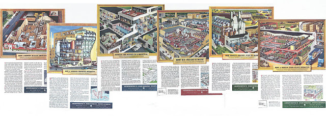
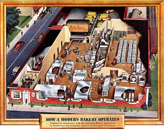
Artist Frank Soltesz (1912- 1986) was probably unknown outside the commercial art and publishing world he worked in all his life but his lasting legacy now seems to be these stunning cutaway illustrations he painted between 1947 and 1951 for Armstrong Cork. The only background details available seem to be from his son’s website created in 2008. Here, Ken Soltesz, reveals his dad’s life as an illustrator. During the war years he had a deferment because of essential war work doing technical illustrations of aircraft for various defense manufacturers.
    After the war Soltesz went freelance and used an artists agent to generate commissions. One of these was Armstrong Cork who wanted ad illustrations to show how their products were used. I thought it odd that these ads, which ran in the Saturday Evening Post, were for a company that didn’t directly sell anything to the public. To get round this and get the ads looked at complex cutaway illustrations were used and clearly who better than Frank Soltesz to do them. His son says 29 were produced for Armstrong though I’ve only managed to find twenty-five. Cleverly each ad picture was in a frame and titled and readers could send off for a 21 by 22 inch copy, as the ad says ‘suitable for framing’. Later ads in the series offered a free booklet with thirteen of the cutaways.
    The amount of detail in these paintings is incredible and a nice touch, I thought, are the number of pedestrians walking past these plants. An obvious question is how long did each painting take from initial rough to the finished art…we’ll probably never know. Also, what happened to them once they had appeared in the ads? I class Soltesz as a unique talent: the king of the popular cutaways (rather than the technical type) in the same creative league as Carl Evers who painted amazing cityscapes of Philadelphia. Featured in Illustrations 3, December 2011.


This copy is typical of what the ads said, it mostly keyed into the numbered diagram.  The ad appeared in the Saturday Evening Post March 12, 1949. 


Saturday, January 14, 2012

Show Magazine / first issue 1961


Books about fifties and sixties graphic design usually show this first issue cover because it’s so striking. Such an obvious concept but it needed a Henry Wolf (left) and a willing publisher to carry it out perfectly and I doubt any first issue cover since has used a huge one on a black background. Wolf (1925-2005) was one of great Art Editors of the period. First for Esquire in 1952, then Harper’s Bazaar 1958, replacing Alexey Brodovitch and Show 1961.
    This first issue ran to 128 pages including a twenty-four page section Review printed on kraft paper which was trimmed narrower than the magazine.  I've left out some of these Review pages and few that included text and small ads that appeared in the front and back of Show.  Though there are less than twenty four-color pages Wolf creates some interesting pacing with large photos and simple graphics between several all text pages. The whole page head shots became a regular feature in subsequent issues.