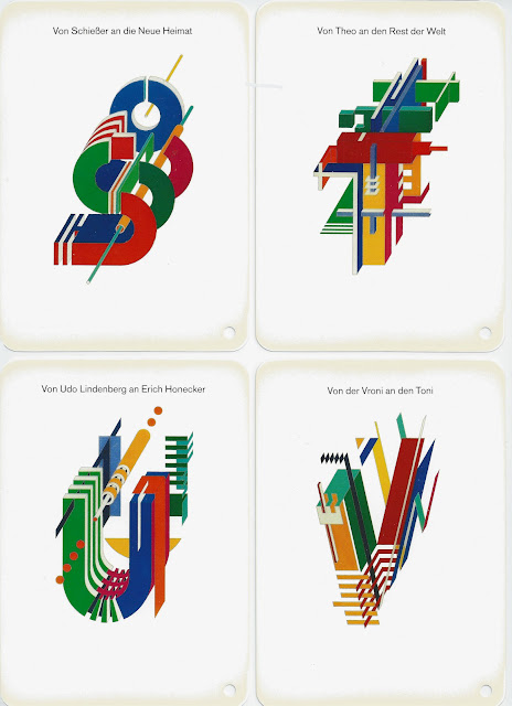
This lovely alphabet is probably a unique example of Constructivist design tracing its roots back to the Bauhaus and mid-European art during the Twenties and Thirties.
Rosenthall published a small fan-out booklet (right) for shops so that customers could see what their initials looked like before ordering. I don't suppose there are too many of these around now though I can't believe it's worth much except to typographers and graphic art folk.
Rosenthall published a small fan-out booklet (right) for shops so that customers could see what their initials looked like before ordering. I don't suppose there are too many of these around now though I can't believe it's worth much except to typographers and graphic art folk.
I had P(amela) and R(obin) put on a vase as a wedding anniversary gift. The back of the vase had the word Happiness in twelve languages, though that was set in Helvetica Light caps, twelve lines centered and glazed in gray.
 |
| My wedding anniversary vase with P and R. |
 |
| Twelve page brochure, 8.75 by 8.5 inches. |


I ordered a vase with the initial of my mother. The order was accepted but was later informed that production was discontinued. I was terribly disappointed as some time before I acquired a vase (the tallest on) with the initials of my father.
ReplyDeleteI have a (black) vase with the initials VL (Vivien Leigh) . . .
These are great and so eighties!
ReplyDelete