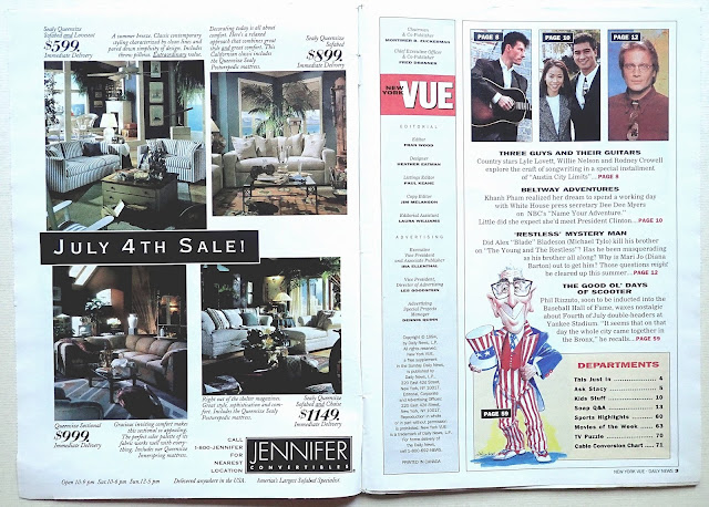
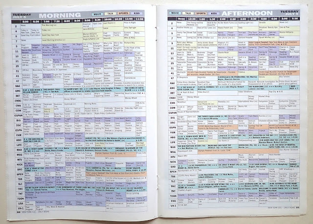
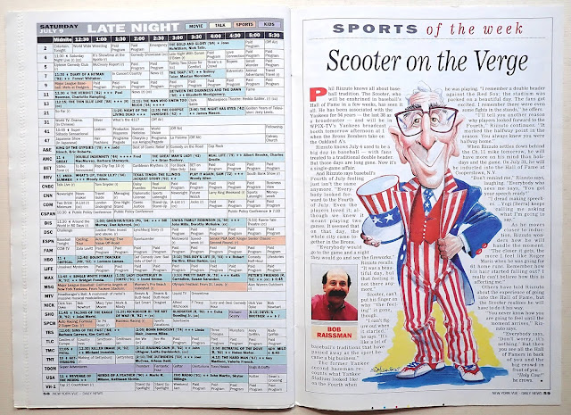
I saved this TV weekly because of the well-designed listing pages. The format is something a lot of designers would prefer not to get involved in, how can anyone be creative with only small type and maybe the option of color. Using various weights of Franklin Gothic, all in the same size and color panels to identify specific types of programming works well on these pages. Overall a well-designed solution to handling a lot of information. You can also see what you might have missed in July 1994.


As a person who was just beginning to enter the field of graphic design in 1994, I salute this designer (Heather Eatman?) for her ability to place a lot of info in a small space in an efficient, appealing way!
ReplyDelete