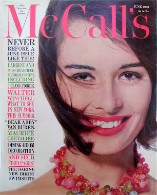
 Otto Storch was the Art Director of McCall’s for fourteen years from 1955. He was one of the New York School of designers that gave popular magazines a circulation lift from the mid-fifties onwards. Others included Bill Cadge on Redbook, Henry Wolf for Esquire and Show, Allen Hurlbert on Look and Arthur Paul for Playboy.
 I always thought Storch was the best of the bunch because of his knack of creating easy-on-the-eye pages that pulled you in to read them. Like Herb Lubalin, Storch was very keen on expressive typography on the page. Some of these type spreads are shown below and look perfect because the choice of the headline type, sub-head and story length blend together seamlessly. Have a look at The Dietrich legend and Dream up a dressing room with the huge brackets, they look as perfect today as the did fifty years ago.
Another Storch visual technique was integrating photography and headlines, especially with the food photos, mostly taken by the brilliant Paul Dome, look at his wonderful hot dog and corn cob below. The fashion and beauty pages also looked different because the headlines and other photo graphics on the page create a fresh take on clothes and accessories.
Parts 2 and 3 are in the December 2012 archive.
...now go to December 2012 archive for Parts 2 and 3


Hi Robin,
ReplyDeleteThanks for a great website. I so appreciate you sharing all the wonderful illustrations and pictures and introducing such great books to us newer collectors.
Debbie K in Oregon. :)
Lovely work, I suspect he was very influenced by Brodovitch. The way image and type interact was an AB feature.
ReplyDeleteSteveH
I agree with above, AB feature. although, it is also clear that Otto S. was a talented designer who arranges txt and image effectively. Thank you for awesome posts.
ReplyDeleteHi Robin,
ReplyDeleteI'm writing a little essay about food and graphic design and I would ask you if you know the exact bibliographical informations of these pages of Storch:
“Take an egg”
“Plus Perfect Parfaits”
"frozen-foods"
"corn".
I live in Milano and I couldn't find MacCall's in Italian Libraries, otherwise I would examine the volumes of the magazine to find the correct number, year and month.
I would be very grateful if you could help me.
Kind regards,
Leonardo
Leonardo: the spreads are ones that I saved from McCall's magazine in the late fifties. As far as I know there is no book of Otto Storch's work.
DeleteThank you for your answer, Robin .
DeleteMeggs' History of Graphic Design tells that "frozen-foods" pages are from 1961 (see caption of figure 19.33).
Kindest regards,
Leonardo
I am very happy to read this article. Thanks for giving us go through info. Fantastic nice. I appreciate this post.
ReplyDeleteThis article is very useful for me, I am going to bookmark this website and I will always check out the latest information here.
ReplyDeletei worked with otto storch, as a stylist, spent the day with him watching man landing on the moon in his studio in 28th st, which was a former firehouse. very talented man. his wife; dolores salice was nice too. bob newey
ReplyDelete