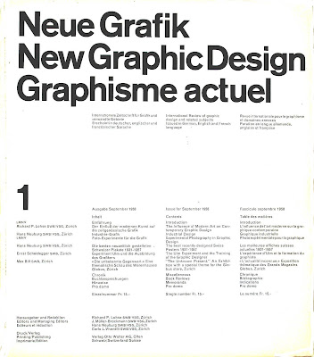
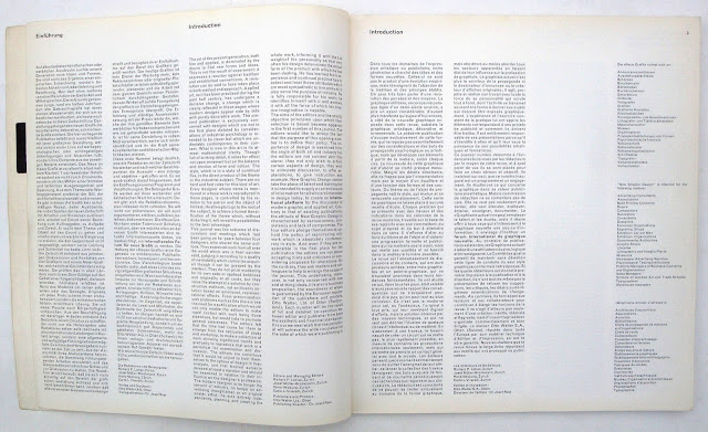
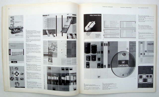
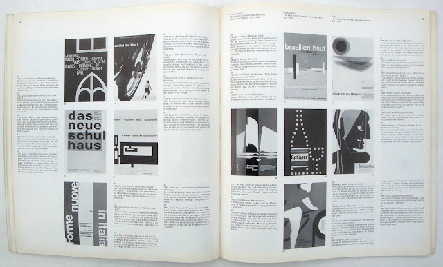
Carlo Vivarelli designed the grid for the eleven by ten-inch page and it was followed rigorously with articles and captions in three languages. Because the typographic format was so uncompromising I always thought it was a bit of a struggle to read the articles. The continental style of having no par indents made many columns, especially in German, sold blocks of text, though captions were fortunately grouped together in each language. Oddly the text was set in Monotype Grotesque 215 rather than the Swiss favored Anzidenz Grotesk.
Publication of the magazine was somewhat erratic because the four editors were working professionals rather than publication editors and the last issue in 1965 was a combined seventeen and eighteen. I still love the look of the first cover, now fifty-five years old and a timeless piece of design.


No comments:
Post a Comment