

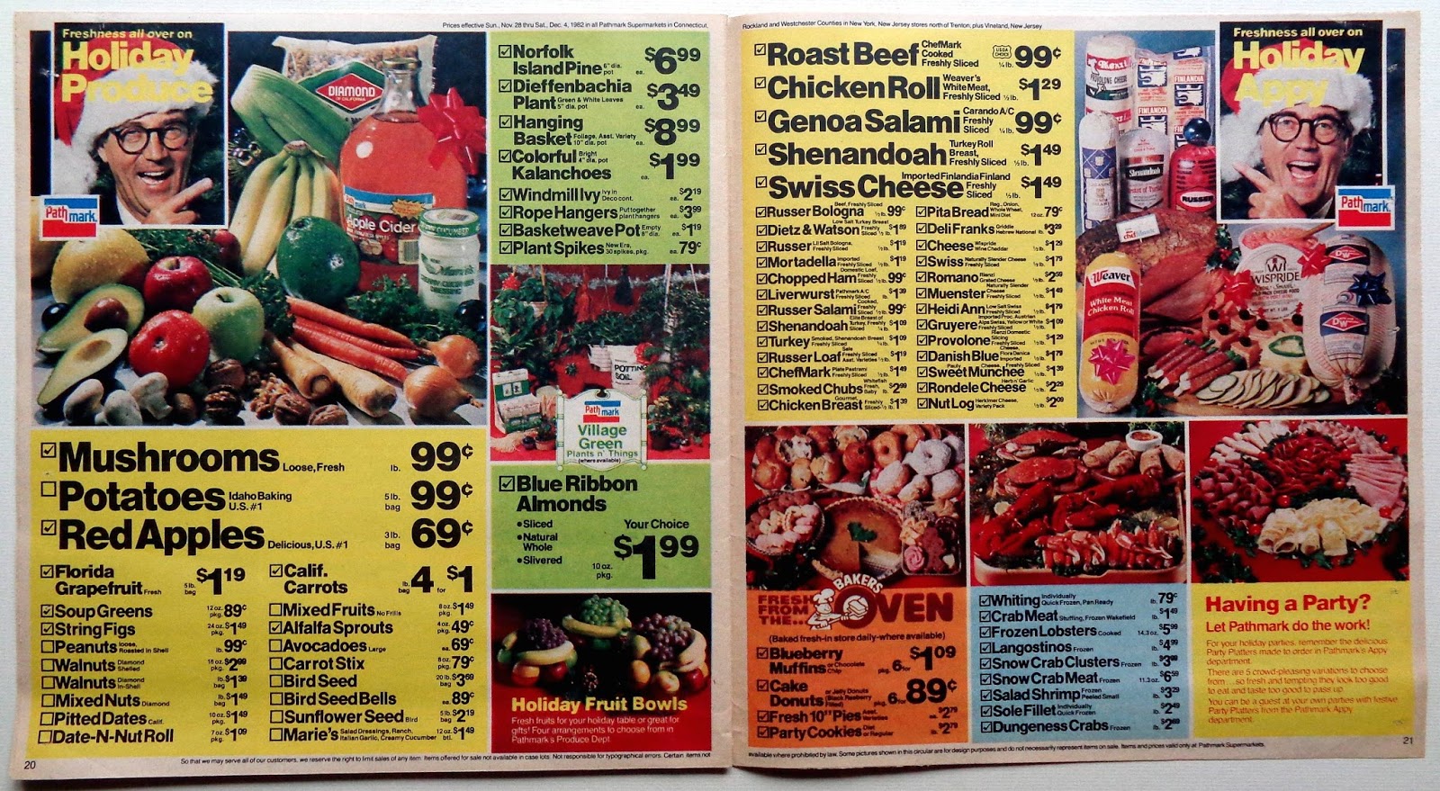
What caught my attention when I saw one in 1982 was the use of Helvetica in various weights and sizes, not a face that would normally be associated with this type of design but what really separates these flyers from others is the use of photos. Usually they have lots of cutout color product shots angled on the page and that makes them look very messy. Pathmark solved that problem by photographing the relevant packs in a still life shot with the copy below the image.
These pages have a ton of information and it's all packed in but they look very clean and controlled. It's almost a pleasure to clip the coupons. Incidentally, regular shoppers could well study the prices from back then.


Thank you for posting the Pathmark ads. After seeing them I remember them well. I agree these were some of the best designed ads in history. I am a huge fan of Pathmark. I have bins filled with old packaging of the Pathmark brands. I will never give them up! Thank you again. It surely is a pleasure viewing your crystal clear photos of these wonderful ads.
ReplyDeleteI Loved Pathmark Potato Chips, I Wish There Was Close-Up Pics Of Bags Of Them
ReplyDelete