I
have always thought and I bet it’s a minority view among designer folk, that
the most challenging and stimulating design jobs are those that use a minimum
of creative resources: an airline timetable; financial pages of an Annual
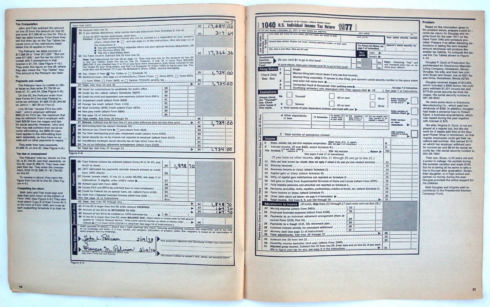
Report; Post Office Customs Declaration label or the example below from the IRS
in 1977. Though it has four color it is
essentially a black and white (12.75 by 10.75 inches) forty page booklet full
of copy and sample tax forms.
It could
look deadly dull but it isn’t because someone has put a lot of creative thought
into the presentation. The thick and
thin rules across the top of each page, the large chapter numbers, four column
pages which vary in depth and ragged right copy predictably set in Helvetica, the universal
typeface. Just to prove it's not all taxing the back page has a crossword based on the copy though I've never found out where the answers are.
What gives all the pages a
lift are the illustrations which blend in perfectly with the relevant
copy. I particularly like the cover with
its interesting graphic and typography.
It was made into a poster and hangs in the IRS headquarters. Oddly there no design or illustration
credits.




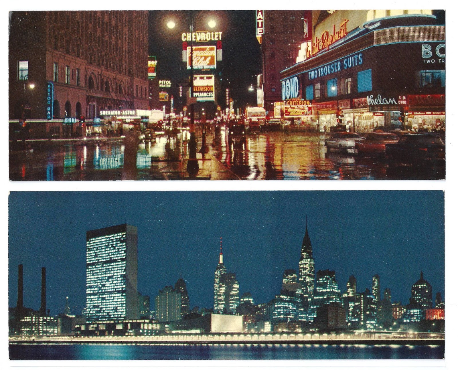
 I bought these wide cards in 1960 and I was fascinated by
the night shots of skyscrapers with their lights blazing. I also only searched out cards that didn't have any type or graphics on the front, not too easy as most had some sort of statement ruining the visual appeal of the photo.


 I
have always thought and I bet it’s a minority view among designer folk, that
the most challenging and stimulating design jobs are those that use a minimum
of creative resources: an airline timetable; financial pages of an Annual
Report; Post Office Customs Declaration label or the example below from the IRS
in 1977. Though it has four color it is
essentially a black and white (12.75 by 10.75 inches) forty page booklet full
of copy and sample tax forms.