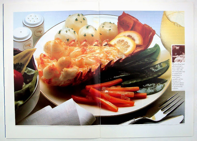
 The perfect brochure to promote Qantas (the Queensland And Northern Territory Aerial Services, started in 1920). Thirty-six pages and designed by Kit Hinrichs, he says it was designed sometime in the early to mid 1980s. Hinrichs is a designer from the old school which believed in doing things properly, for example: text wrap drop caps; use a limited number of typefaces; blend big and small photos and graphics on the page so that nothing looks out of place; lock cutout images into text areas.
All of these and more are working hard on every page here. From the perfect front and back cover (above) to the center which has a wonderful fold-out, thirty inches wide, with twenty-nine small visual items with captions and a big strip graphic across the middle. Despite the busyness it all works perfectly. This Qantas brochure really cannot be faulted and it could just as easily be published today because the concept is timeless.
In 1990 Kit Hinrichs wrote a book Type wise (ISBN 0891343563) about typography and his thoughts on design, well worth searching out on the net.


Wow! This is wonderful post. It's sharing a lovely picture of the Qantas. I really appreciate to visit this nice post.
ReplyDeletecheap qantas